
In recent years, the hamburger style menu (aka 3-bar menu) has been gaining popularity in the web design space and is now widely implemented by many of the industry leaders.
Let me prove my point by showing you some concrete examples from the big companies.
The following menus are viewed in mobile…
1. Apple Home Page

2. AWS Home Page
3. Airbnb Home Page
4. Microsoft Home Page

5. Think With Google Home Page
What do these menus have in common? Yep, they all implement a hamburger menu!
Because of this trend, you’ll begin to see more and more websites are incorporating this type of design into their mobile navigation menu. Therefore, I can understand why many of the OptimizePress users I’ve come across are requesting this feature to be added.

Here’s a quick preview of how the OptimizePress navigation menu looks in mobile…
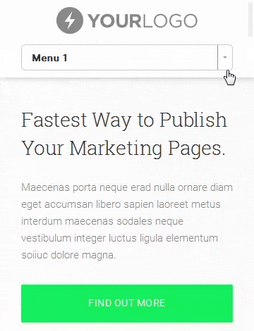
Personally, I think the toggle menu looks fine
Let’s Create A Simple Hamburger Menu In OptimizePress
Before we proceed, there are three things I want you to be aware of. First, you need to use the same hamburger menu for all your LiveEditor pages + Blog posts. Second, make sure you’ve already set up the menu (See #1 here) in WordPress. Third, just in case you need help, I don’t provide support or any customization you want to make.
#1 Install ShiftNav Responsive Mobile Menu: There are quite a number of WP plugins out there that can help you get a hamburger style menu. The reason I choose ShiftNav is simply because I like how clean (smooth) the design is. Moreoever, it was created by the same author who created UberMenu, i.e. the most popular menu plugin in CodeCanyon.

In your WP Dashboard, go to Plugins and select Add New. Enter “ShiftNav” in the Search Plugins box and you’ll see the plugin appears in the Search Results. Click the Install Now button. Once the plugin is successfully installed, click the Activate Plugin link to activate it.
#2 Disable CSS And JS Files From Rendering In LiveEditor: In your WP Dashboard, go to OptimizePress → Support. Choose the Disable Styles and Scripts section. Under Disable for back-end (LiveEditor), check the CSS and JS boxes and click Save Settings.

If you don’t disable the CSS and JS, you’ll encounter issues with editing in the LiveEditor.
#3 Assign The Menu You Want To ShiftNav: In your WP Dashboard, go to Appearance → Menus. Click the Manage Locations tab above and assign a menu to ShiftNav [Main].

You can either use an existing menu or set up a new menu for this. Click Save Changes.
#4 Configure The Toggle Bar Settings: In your WP Dashboard, go to Appearance → ShiftNav. Click the Toggle Bar tab above and then configure the following settings…

- Toggle Breakpoint: 961 (enter 960 if you’re NOT using the OP blog functionality)
- Hide Theme Menu: .banner, .navigation, .op-page-header (including the comma)
- Toggle Content: Enter your business name or use the default [shift_toggle_title]
- Toggle Bar Position: Select either a sticky (Fixed) or non-sticky (Absolute) menu
- Background Color: The background color of the hamburger menu. I’ll use Black
- Text Color: The text color of the Toggle Content (business name). I’ll use White
- Font Size: Set the size of the Toggle Content and hamburger icon. I’ll use 17px
Once you’re done with the Toggle Bar settings, go ahead and click Save Changes.
#5 Configure The Main ShiftNav Settings: Head over to the Main ShiftNav Settings tab and configure the following settings. You can actually leave these settings as default…

- Edge: Select which side you want the hamburger icon to appear › Left or Right
- Skin: The free version comes with two skins › Standard Dark or Standard Light
- Display Site Title: I’ll uncheck this box so the site title won’t appear in the menu
Once you’re done with the Main ShiftNav settings, remember to click Save Changes.
Here’s the preview of how the hamburger menu looks so far in mobile…
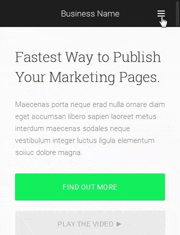
That’s pretty slick, don’t you agree?
I know you’ll have questions about customizing the menu even further. Obviously, I can’t give you every customization you wish to make but I’ll share the important ones with you.
[Bonus] Let’s Spice Things Up A Little With CSS, Shall We?
Click the General Settings tab and insert the following CSS code to CSS Tweaks….

#6 Insert Your Logo Image To The Toggle Bar
#shiftnav-toggle-main .shiftnav-main-toggle-content {
background-image: url(“LOGO_URL”);
background-position: center center;
background-repeat: no-repeat;
background-size: 200px auto; /* Set to 200px width */
color: transparent; /* Make the title color transparent */
}
#7 Change The Highlight Color Of Current Menu Item
Apply this CSS if you’re using the Standard Dark Skin:
.shiftnav.shiftnav-skin-standard-dark ul.shiftnav-menu li.menu-item.shiftnav-active > .shiftnav-target, .shiftnav.shiftnav-skin-standard-dark ul.shiftnav-menu li.menu-item.shiftnav-in-transition > .shiftnav-target, .shiftnav.shiftnav-skin-standard-dark ul.shiftnav-menu li.menu-item.current-menu-item > .shiftnav-target, .shiftnav.shiftnav-skin-standard-dark ul.shiftnav-menu > li.shiftnav-sub-accordion.current-menu-ancestor > .shiftnav-target, .shiftnav.shiftnav-skin-standard-dark ul.shiftnav-menu > li.shiftnav-sub-shift.current-menu-ancestor > .shiftnav-target {
background: #03d359; /* Default background #35ac6a */
color: #fff; /* Default text color #eee */
}Apply this CSS if you’re using the Standard Light Skin:
.shiftnav.shiftnav-skin-light ul.shiftnav-menu li.menu-item.current-menu-item > .shiftnav-target, .shiftnav.shiftnav-skin-light ul.shiftnav-menu > li.shiftnav-sub-accordion.current-menu-ancestor > .shiftnav-target, .shiftnav.shiftnav-skin-light ul.shiftnav-menu > li.shiftnav-sub-shift.current-menu-ancestor > .shiftnav-target, .shiftnav.shiftnav-skin-light ul.shiftnav-menu li.menu-item ul.sub-menu .current-menu-item .shiftnav-target {
background: #03d359; /* Default background #007aff */
color: #fff;
}
#8 Reduce Box Shadow On The Side Of Menu Panel
.shiftnav::after {
box-shadow: 0 0 3px rgba(0, 0, 0, 0.3); /* Default 0 0 15px rgba(0, 0, 0, 0.8) */
}
#9 Insert A Hover Background Color When Hovered
I recommend using the same background color as #7. In the General Settings tab, scroll down to the bottom and check the Highlight Targets on Hover box. Click Save Changes.
Apply this CSS if you’re using the Standard Dark Skin:
.shiftnav.shiftnav-nojs.shiftnav-skin-standard-dark ul.shiftnav-menu li.menu-item > .shiftnav-target:hover, .shiftnav.shiftnav-skin-standard-dark ul.shiftnav-menu.shiftnav-active-on-hover li.menu-item > .shiftnav-target:hover, .shiftnav.shiftnav-skin-standard-dark ul.shiftnav-menu.shiftnav-active-highlight li.menu-item > .shiftnav-target:active {
background: #03d359; /* Recommend you use the same as #7
color: #fff;
}Apply this CSS if you’re using the Standard Light Skin:
.shiftnav.shiftnav-skin-light.shiftnav-nojs ul.shiftnav-menu li.menu-item > .shiftnav-target:hover,
.shiftnav.shiftnav-skin-light ul.shiftnav-menu.shiftnav-active-on-hover li.menu-item > .shiftnav-target:hover, .shiftnav.shiftnav-skin-light ul.shiftnav-menu.shiftnav-active-highlight li.menu-item > .shiftnav-target:active {
background: #03d359; /* Recommend you use the same as #7
color: #fff;
}
#10 Hide ShiftNav From Showing On Specific Pages/Blog
To hide the hamburger menu from showing on specific pages, e.g. your offer pages, just add the following code into the OP LiveEditor (Page Settings → Other Scripts → Custom CSS). You can also hide it from showing on the blog (Blog Settings → Modules → Other Scripts → Custom CSS), but note that the default OP Navigation will be hidden as well.
#shiftnav-toggle-main, .shiftnav-toggle-mobile {
display: none;
}.shiftnav-wrap {
padding-top: 0 !important;
}
#11 Fix The Hamburger + Close Italic Icons On OP Blog
If you’re displaying the ShiftNav menu on your OP Blog, you’ll notice that the Hamburger icon and Close icon appear in an italic look. You can easily fix that by adding this CSS code to Blog Settings → Modules → Other Scripts → Custom CSS:
.fa-navicon::before, .fa-reorder::before, .fa-bars::before {
font-style: normal;
}
Here’s the customized version of the hamburger menu in mobile…
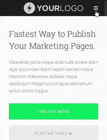
How are you liking the customized menu?
Of course, there are a few other options you can play around with. What I’ve shared here is just to help you create a simple and clean looking hamburger menu in OptimizePress.
And if you like how the free version works on your site, you might want to consider getting the Pro version (which provides you some advanced features) to support the developer.
I hope you find this tutorial helpful. Let me know your thoughts by commenting below.
P.S. I’ve compiled all the CSS code into a TXT file. Click here to download if you want it.

» List Of All OptimizePress 2.0 Elements You Can Add In LiveEditor
» How To Create An Ultra Clean OP 2.0 Landing Page Template
» Watch Me Design An Elegant Squeeze (Opt-In) Page Template
» How To Create An OP 2.0 Membership Site In 5 Simple Steps
» How To Set Up An OP 2.0 Membership Site With OptimizeMember
» Design A Kajabi Style Membership Using Pre-Made Templates
» 40 CSS Code You Can Implement To Customize An OP 2.0 Blog
» How To Add Smooth Scrolling Effect To An OptimizePress Page
» How To Design A Beautifully Looking OptimizePress Navigation
» Visit OptimizeTemplates.com For More OP Pre-Made Templates
Is there a reason why we can’t highlight and copy the css code you talk about to use?
See the last part. You can download the TXT file which consists of all the CSS code.
Hi! Thanks for this one as well. One question.
I’ve got the same menu currently on the main site + blog, but there is a also a membership portion on the site using OptimizeMember which uses a different menu to show all the membership content. It uses the live-editor.
So did I understand correctly that in this case we can’t change the main site + blog menu to a hamburger without it messing up the menu on the membership site?
Thanks!
If you’re using ShiftNav plugin, you can only have one hamburger menu for your site.
Awesome read and tutorial.
How does one get the “search” feature in the OP2 or ShiftNav menu?
The Pro version of ShiftNav allows you to easily add a Search bar in the menu.
Hi KM Lee,
Can I hire you out to do some customisation on our new website we are building?
Hello Nick,
Unfortunately I no longer doing freelance work for clients anymore as I’ve focused all my time working on my own thing.
Maybe you can search on sites like Upwork or Elance. There are quite a number of freelancers who offered similar kind of services. I’m sure you’ll find many out there who understand CSS customization.
Hope you’re able to find the right person to work with you asap.
I ended up getting the pro version, but keep seeing the shift nav at the bottom of the Optimize Press live editor. I added the code you offered and took the necessary steps to remove it.
Any ideas? Also, does this plugin slow down most sites via site speed?
I didn’t purchase the PRO version. Have you followed #2?
Hello, awesome tutorial. I made it by following your procedure. You can check it. I want to change my font to open sans and bold. How can I do that?
Hello!
This is a great tutorial, I loved how it takes you step by step and makes it so easy to follow. I was wondering if you’ve seen this problem and how to solve it. I’ve tried other plug-ins in the past. I was hoping this tutorial and plug-in would be “the one” but I keep encountering the same issue. I end up with 2 menus, it shows the ‘hamburger menu’ and some pages it shows overlapping optimize wordpress dropdown menu. Do you have a code to hide it? Or is it something else I might be missing? I’m also using their newest theme “smart theme”. I also noticed that the hamburger menu shows completely fine on the blog page but not the other pages, the other pages will show 2 menus if I have the plug in installed. Thanks!