
Update: I’ve created a new tutorial showing how to create a header menu in OP 3.0.
If you’ve been using OptimizePress for awhile, then you probably agree with me that the navigation header doesn’t look that great, especially without any custom styling applied.
Fortunately, there’s a workaround for that. All you need is insert a few lines of CSS code and in no time, you’ll be able to design a stunningly looking header just like the big boys.
You say, “hey KM, I don’t know a single bit of CSS.” Well, that’s what I’m about to share with you here. But before I do, let’s first examine what would a perfect header look like. The easiest way to find out is by looking at the websites of some of the leading brands.
Let me give you a few really great examples…
1. Think With Google Home Page
2. Infusionsoft Home Page
3. Aweber Home Page
4. Focus Lab Home Page
5. Freelancer Home Page
Can you see the common patterns? Here are some of the important observations…
- Small logo: the width is not more than 200px and the height is not more than 50px
- Slim header: the entire header won’t take up too much space at the top of the site
- Tidy menu items: items are in line with the logo and spaced nicely with each other
- Uppercase texts: some, but not all of the menu items are set in fully capital letters
- CTA button (or text): there is some sort of call-to-action in one of the menu items
Here’s what the default OptimizePress alongside navigation looks like in a browser:
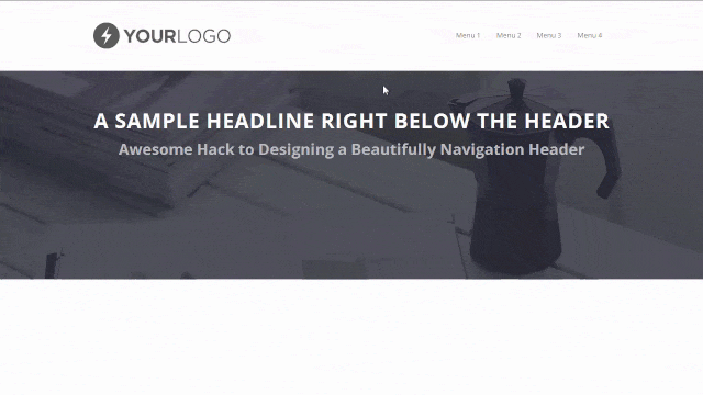
Dark Logo (250px width), White Background, Open Sans Font (13px)
Let’s Beautify The OptimizePress Alongside Navigation
All the code should be added to Page Settings → Other Scripts → Custom CSS
#1 Reduce The Header Height: To do this, all you need is modify the top and bottom padding of the header (default is 40px). In this example, I’m going to reduce it to 15px.
.banner {
padding: 15px 0;
}
#2 Reduce The Logo Width: The default logo width is 250px but I want it to be 225px. Also, I want to add an extra 2px of padding to the top just to move the logo down a bit.
Tip: Your logo height should be less than 50px and the design should look uncluttered.
.banner .op-logo img {
max-width: 225px;
padding-top: 2px;
}
#3 Transform Menu Items To Uppercase: This step is optional. But if you want the menu items in uppercase letters, then throw in the following code. Just for showing purposes, I’d also like to increase the spacing between the menu characters by 1px.
.banner .navigation a {
text-transform: uppercase;
letter-spacing: 1px;
}
#4 Increase Spacing Between Menu Items: You may increase the distance between the menu items by using the code below. The purpose is to let people skim through the items easily. Default padding is 1.2em 1.1em.
body .container .navigation ul li a {
padding: 1.2em 1.3em;
}
#5 Remove Hover Effect On Menu Items: Personally I’d prefer there’s no hover effect (grey background) when mouse over to the menu items. It looks so much cleaner to me.
/* For Main Menu */
body .container .navigation > ul > li:hover {
background-color: transparent;
}/* For Sub-Menu */
body .container .navigation ul ul li:hover > a {
background-color: transparent;
}
However, you can change the hover link color if you want. Go to Colour Scheme Settings → Page Colour Settings → Navigation Bar Alongside Logo Colour Options → Navigation Hover Link Text. Feel free to change the color for your main Navigation Link Text as well.
Let’s add a call-to-action button to the header…
In your WordPress Dashboard, go to Appearance → Menus. Click Screen Options on your top right and check the CSS Classes option. Under Menu Structure, select a menu item, click Custom Link and enter a name into CSS Classes field. Then hit Save Menu.
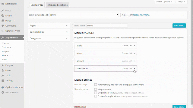
You May Enter Any Name You Want. Just Make Sure It’s Unique
#6 Create A CTA Button: Launch the LiveEditor of your page and insert the following code (Note that redbutton is the same name you’ve entered in the CSS Classes field).
You may change the background, border, border radius, or padding to suit your needs.
.redbutton a {
background: transparent !important;
border: 2px solid #eb6126 !important;
color: #eb6126 !important;
-webkit-border-radius: 3px !important;
-moz-border-radius: 3px !important;
border-radius: 3px !important;
margin-left: 16px !important;
padding: 14px 15px 13px !important;
}/* On Mouse Hover */
.redbutton a:hover {
background: #eb6126 !important;
border: 2px solid #eb6126 !important;
color: #fff !important;
}
#7 Add Simple Transition Effect: You can add this line of code (in blue) into #3 just to make the transition goes smoothly when mouse over to the menu items and the button.
.banner .navigation a {
text-transform: uppercase;
letter-spacing: 1px;
transition: all 0.3s ease-in-out 0s;
}
Here’s what the OptimizePress alongside navigation looks like after customization:
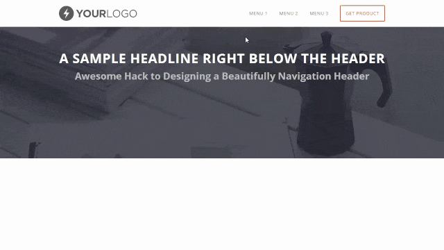
Dark Logo (225px width), White Background, Open Sans Font (13px)
As you can see, the navigation header looks pretty slick (agree?) after applying all the 7 customization above. Of course you can take things even further, e.g. making the header sticky just like what I’ve done on some of my OptimizePress templates, adding font icons to the menu items (watch video below), or adding some fancy hover effect to the button.
Update: I’ve created a new tutorial showing how to create a header menu in OP 3.0.
There you have it! I believe I’ve covered most of the important customization that people want to make. I’ve personally tested the CSS code on a demo site. I really hope some of you’ll find the custom code here useful when designing your header with OptimizePress.
P.S. I’ve compiled the 7 CSS code into a TXT file. Click here to download if you want it.

» List Of All OptimizePress 2.0 Elements You Can Add In LiveEditor
» How To Create An Ultra Clean OP 2.0 Landing Page Template
» Watch Me Design An Elegant Squeeze (Opt-In) Page Template
» How To Create An OP 2.0 Membership Site In 5 Simple Steps
» How To Set Up An OP 2.0 Membership Site With OptimizeMember
» Design A Kajabi Style Membership Using Pre-Made Templates
» 40 CSS Code You Can Implement To Customize An OP 2.0 Blog
» How To Add Smooth Scrolling Effect To An OptimizePress Page
» How To Build A Hamburger Style Mobile Menu In OptimizePress
» Visit OptimizeTemplates.com For More OP Pre-Made Templates
Hi KM Lee,
Thank you for great tutorial for header hacking!
Anyway, Could you help me to adjust position of alongside menu in vertical? I would like to arrange it in vertical but I do not know how to do.
Hello Teerin,
You can use code #4. Try to adjust just the top padding only. To understand more about the padding property, refer to the link below:
→ http://www.w3schools.com/css/css_padding.asp
Thank you for your help, it works very well.
Do you mind if I contacting you via email for job consulting ?
Thank you for sharing! :)
Hi KM Lee,
how do you setup the simple transition effect to a blog page? This effect works on Live Editor pages, but not on blog pages.
Thanks for help, MRC
The code above applies to LiveEditor pages only. For blog, try this…
Thanks for the great tutorials and tricks, your content is so very helpful when dealing with OptimizePress. How did you get your menu to be mobile responsive and have the little ‘hamburger menu’ on mobile? I have been trying to figure out how to do this to my site but have had no luck! Any pointers would be appreciated!
I’m not using OP for this site. Unfortunately, OP doesn’t have the little “hamburger menu” when viewed on mobile. You need to use an external plugin for that.
Update: I’ve written a post on how to create a hamburger style menu in OP. Go here.
Hey man I love your templates and keep buying them lol, quick question, which element did you use for the SENSEI Membership Course Page?
The one with the lady and the email optin form and to the left has the image, then course title and description?
I’m almost done with the page and need this, thanks! :)
It’s actually the Membership Page Listings element. But you need to configure the Membership Page Settings for the relevant membership pages so that the course title and description will show. I mentioned about this in the post here.
Great and usefull post!
Somehow the text in my CTA button does not have the same hight as the rest of the navigation text.. so now there is not evenly distributed white space in my header between the above and below of the CTA button. Can you tell me how to solve this?
Thanks for your help!
Hello Chris,
Are you referring to your coaching site? If yes, add these 2 codes…
Within .banner { }, add
Within .redbutton a { } , add
Let me know if it works for you.
It works! Thank you so much!
Hi and thanks for having some great reference guides for OP2. I’ve been searching for some CSS code to create a hover (rollover?) image over the top of another (background) image and so far I’ve had no luck. Do you know if this is possible in OP2?
Thanks very much in advance.
Haven’t tried something like this before. Do you have a sample site for me to see?
Thanks for your reply. Here’s the one I saw, which sparked my interest. Any ideas in the right direction would be great.
I see what you mean. That would require you to write a bit of coding. Haven’t tried it on OP but I just came across this tutorial. Maybe you can refer to the code there.
Thank you – I’ll see how I go and post here if we get it working!
Hi, I wanted to ask, can you use pages as articles rather than blog format?
I want to create a micro niche type site and have only put about 30 articles on the site.
I intend to use as static site where it won’t be updated often.
Thanks!
Yes you can. All you need is to create your content in the LiveEditor.
Thank You for quick reply!
Hello,
Thanks for this nice tutorial.
I have a problem with the CTA button in the menu. I don’t have the CSS box to enter the “redbutton”. What can I do to solve this? Thanks!
I think you’ve missed out this part: In your WordPress Dashboard, click Screen Options on your top right and check the CSS Classes option.
Hope that helps.
Great tutorial, many thanks for that!
Is it possible to use an image for the call to action button?
Kind regards,
Jo
I’m not sure but you can try inserting the background-image property in #6:
using your CTA button, I’d like the button to be a solid color, and then flip to a different color on hover. I tried changing the background from transparent to something else, but it’s not working. I can change the font color find, just not the initial button color
Did you include !important; in it? Can you show me your site so I can take a look?
Can you change logo for each category of the post? in the blog?
Don’t think you can do that for blog since there’s only one place to upload your logo.
I’m trying to do this with the top header menu instead of the alongside navigation but the code for removing the hover effect doesn’t seem to work for it.
Any ideas on what it should be?
Can you show me your site so that I can take a quick look?
Hi!
Great site, thanks for all the tutorials! Can the CTA button text color be changed somehow to a different color compared to the rest of the menus?
In my menu the default font color is grey on a white background, but the grey text with a orange cta-button isn’t ideal. White text would suit it much better. I’d appreciate if you had some thoughts about it :)
Just take a quick look at your site, you missed out a. The selector should be .tilaa a {
Thank you so much, it worked!
Thanks so much for the help you provide here with OP. I’m trying to remove that extra blank space between my header and the navigation bar. Also remove the blog name.
Would appreciate if you can help with that.
Throw this custom code into the LiveEditor as well as the Blog…
I dont think I understand you. :-). Can you please tell me the steps to do that.
Thank you.
1) For pages, add the code into the LiveEditor. Head over to…
Page Settings → Other Scripts → Custom CSS
2) For blog, in your WP Dashboard, go to Optimizepress…
Blog Settings → Modules → Other Scripts → Custom CSS
Thank you soooo much!
That worked brilliantly. You’re awesome!
KM Lee,
Thank you for all of the CSS you’ve shared on here. I have referred to it many many times!
Are you available for hire? I would like to create this navigation on my pages & duplicate it so that it would like exactly the same on my blog.
As you are aware it doesn’t seem to be any easy way to make your blog and pages look the same with OP2.
Now I’m at the point where I would like to just hire somebody to do the set-up. Please get in touch with me if you are interested. Thank you in advance.
Hello Chris,
Unfortunately I’m also at a point where I no longer doing freelance work for clients anymore as I’ve focused my time working on my own thing.
Maybe you can search on sites like Upwork or Elance. There are quite a number of freelancers who offered OP related services. I’m sure you’ll find many out there who can help you. Hope you’re able to find the right person to work with you asap.
Thank you KM Lee. I will try to do that now. Have a great rest of your weekend :D
At my url I am trying to remove the white space below the header and before the content. I am figuring some css on the custom css section of the page. I am on OptimizePress 1. Do you have any ideas on a snippet of code I could use?
I can remove the white space, but it removes my Javascript and code for the Aweber form.
Any ideas please?
I’m afraid I can’t help you on this because I haven’t touched OP 1.0 for almost 2 years. Version 1.0 is already outdated though.
Hey there,
I’m working on a client website and looking to add a background image to the main nav. bar since we have the background in the logo area and then also right below the nav. bar… it looks funny as is because of the white bar dividing the image.
Here is the preview link. Thanks in advance!
Have you fixed it because I don’t see any white bar on my side? However, you might want to write some code to make the navigation bar looks good in mobile and tablet.
Hey,
Thanks for sharing these great information with us.
I want the same navigation design for my OP site and for my blog navigation. But your code seems to work only on the OP site? Is there a way to share the same layout over all sites?
Yes, the code here only works for pages built in the OP LiveEditor. For the blog, you can find some basic CSS customization in this post (Blog Navigation Customization).
Thanks for the fast reply! Will have a look at it!
Great post! Do you have any custom CSS for improving the row sections so they flow better? The standard format always looks chunky as it has straight bottoms on each row.
Not sure what you mean by that. Do you have some real examples to show?
Hi KM Lee, thank you for so much awesome content.
For some reason I’m not able to select any of the content in this page (so I can copy the codes), is there anywhere else where I can get the codes?
Thanks heaps
Yes, you can download the 7 CSS code at the end of the post.
Hi KM,
Is there a way to have a full width blog header? I managed to do it in regular pages by inserting it’s link in the “Before Row” section in live editor. But what about in blog?
Regards,
Walied
I was wondering how do you make pages link directly to areas on one page?
Thanks Lee, how could I leave the menu background transparent?
Anyway to have the navigation button open up an overlay optimizer with an optin form inside?
I love your content. Thank you.
Just want to ask is there a reason I cannot copy the CSS code from your page?
I ask because I’m paralysed from the chest down with limited arm function, typing is a complete nightmare. I am currently using voice software to write this. Not been able to copy the CSS from your page is a nightmare.
On one hand it really helps, it would just be easier if it wasn’t protected.
You can copy all the CSS code (compiled in TXT file) at the end of the post.
Hey KM. Is there any way to create an overlay optimizer element in the navigation? or at least make one of the menu items open a popup?
Not for now. You’ll need an external plugin for that. But I heard the OP Team is working on a new solution for this. Not sure when they will release the software though.
Hi KM, very valuable content. Thanks.
Is there any custom css to show a full width alongside navigation in a landing page template in OP 2? Just like it seems to be in your great examples #1 and #5 mainly.
I’ve tried the following with no success:
Thanks in advance.
The code you showed is for the OP Blog, not pages build in the LiveEditor.
Refer #4 above and you’ll see the difference.
Thanks for your response KM.
You were right with that.
But, my question really was…How do I make the Logo go more to the left (I want to modify the margin or blank space between browser and logo) and same for the menu navigation items to go to the right.
Let’s say I don’t want the complete alongside navigation menu and logo to be centered and with big margins/spaces in left and right? Sorry I do not know the exact techie language to express it in a better way.
Thanks again.
I get what you mean. Actually that’s the default width of the OptimizePress platform for a full-width page (940px width). If you want a wider layout, it goes a bit technical because you’ll need to modify the column width via CSS code.
The OP platform comes with a few content templates with a wider layout. E.g. Book Launch, Long Form. If you’re a clubhouse member, there are some templates with a wider layout too. Maybe you can start with one of them.
That’s all I can suggest for now.
Hi! Thank you so much for all this great info. I have a question though, I’d love to change the background color of the logo and menu bar, do you have code for that? thanks again.
I believe you don’t need code to do that. In your LiveEditor, go to:
Layout Settings → Header & Navigation → Set a color for or choose a header background colour
To change the background color of the navigation below menu bar, go to:
Colour Scheme Settings → Page Colour Settings → Navigation Bar Below Header Colour Options (you can test each option with a different hex color)